
Overview
Overview
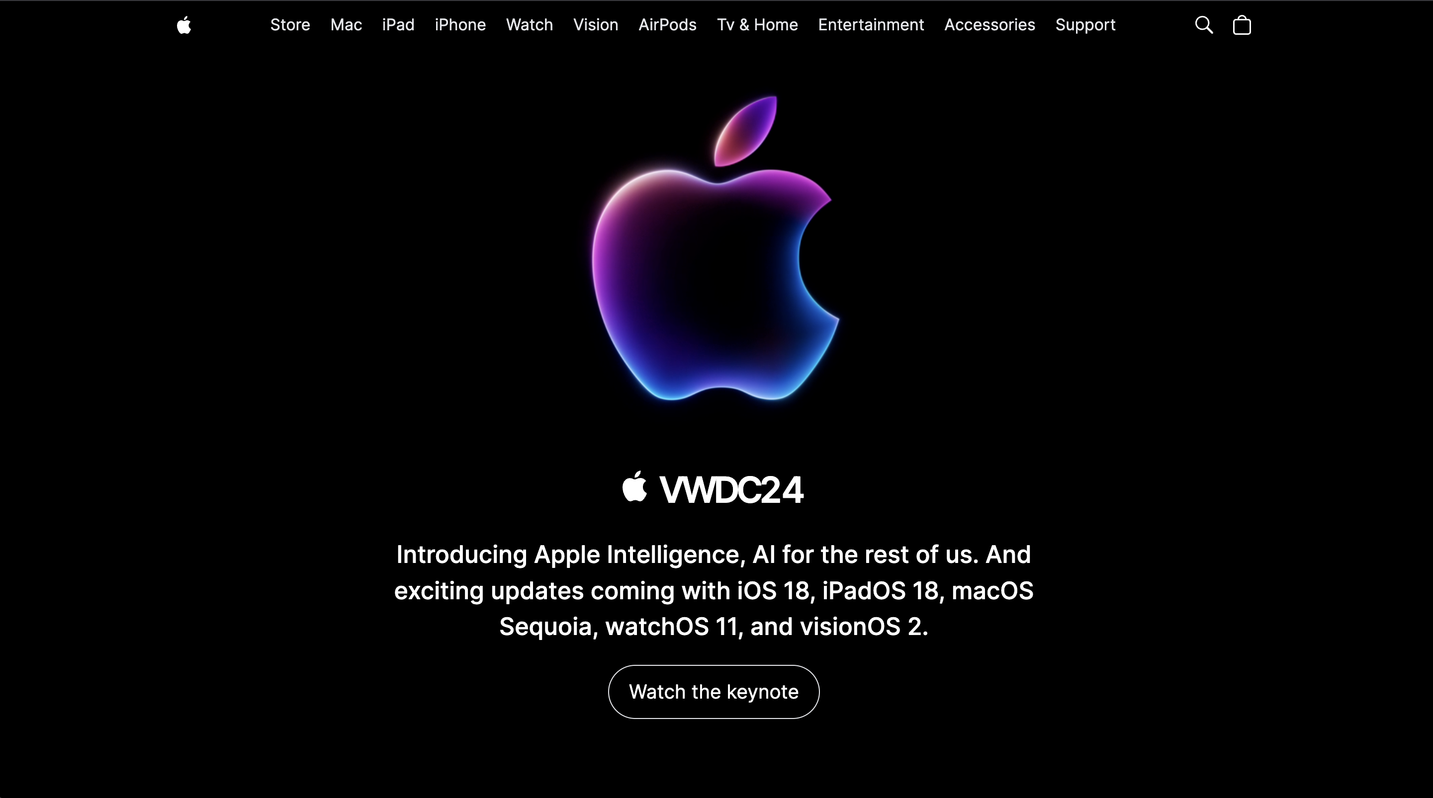
Recreating a premium brand experience on the web
Premium brand sites depend on precise spacing, responsive typography, smooth section transitions, and fast first paint—all harder to maintain when styling is scattered across custom CSS.
Built a pixel-inspired Apple clone using Next.js for server rendering and Tailwind CSS for a consistent design system. Sections are composed as reusable layout blocks with responsive breakpoints and animation-friendly structure.
The project shows how to reproduce a polished marketing experience with modern React tooling while keeping styling maintainable and performance-friendly.
Features
Features
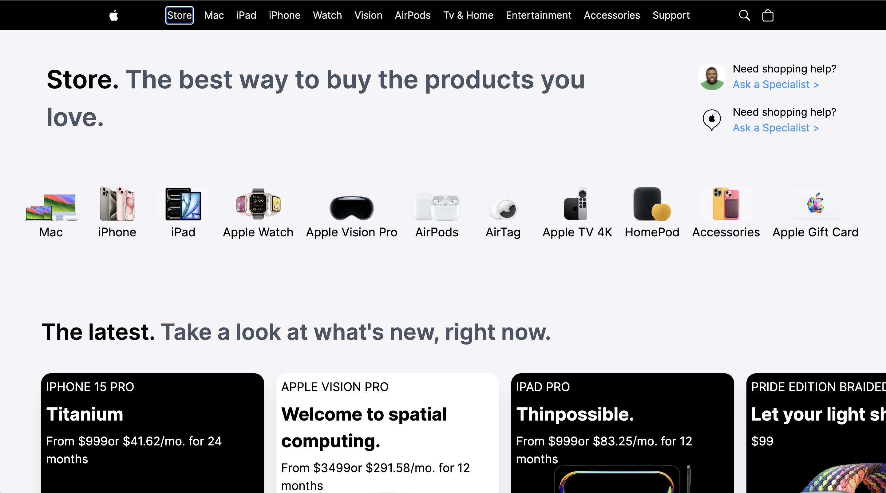
Responsive SSR layout
Server-rendered pages with fluid typography and section layouts across mobile, tablet, and desktop.
Optimized Images
Optimized images for faster loading times.
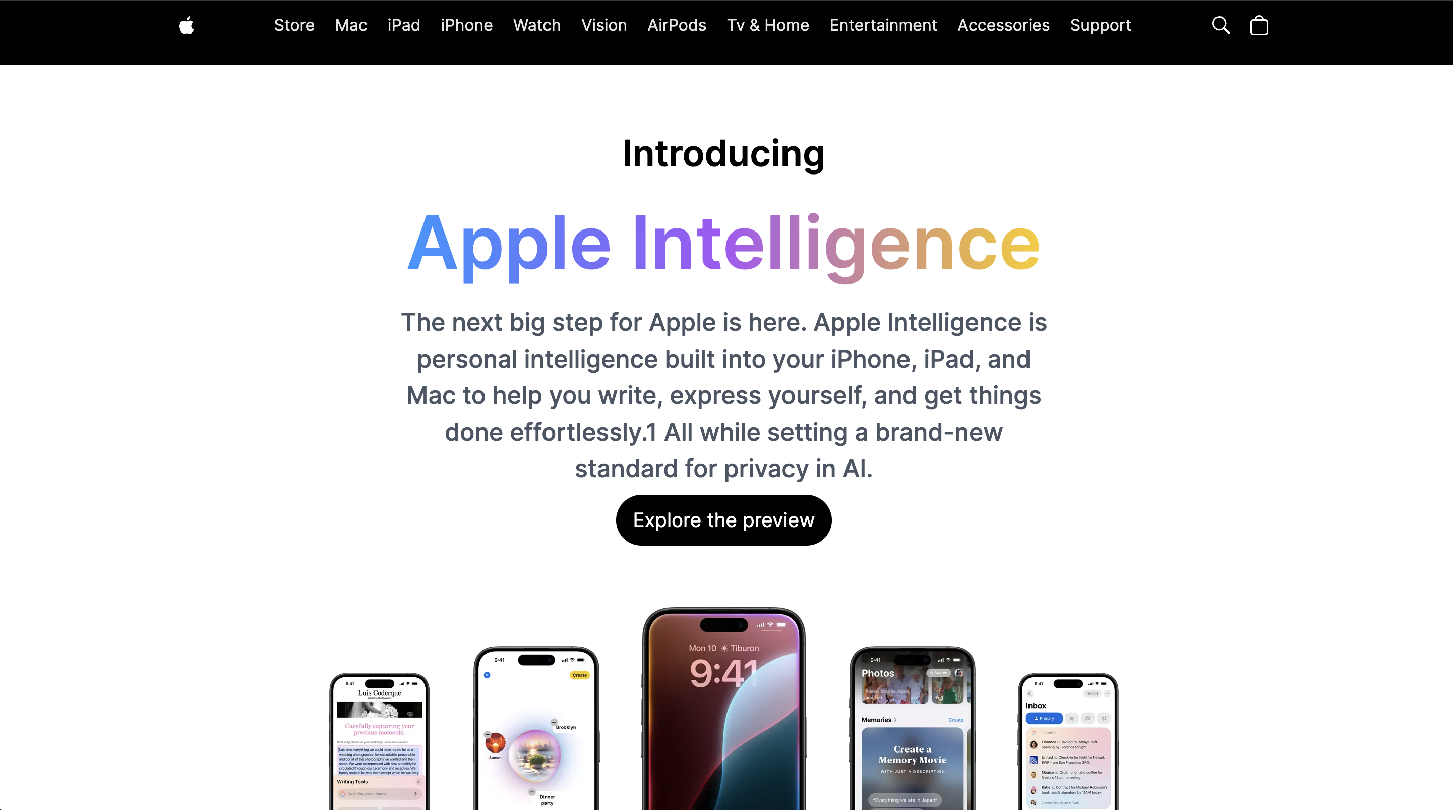
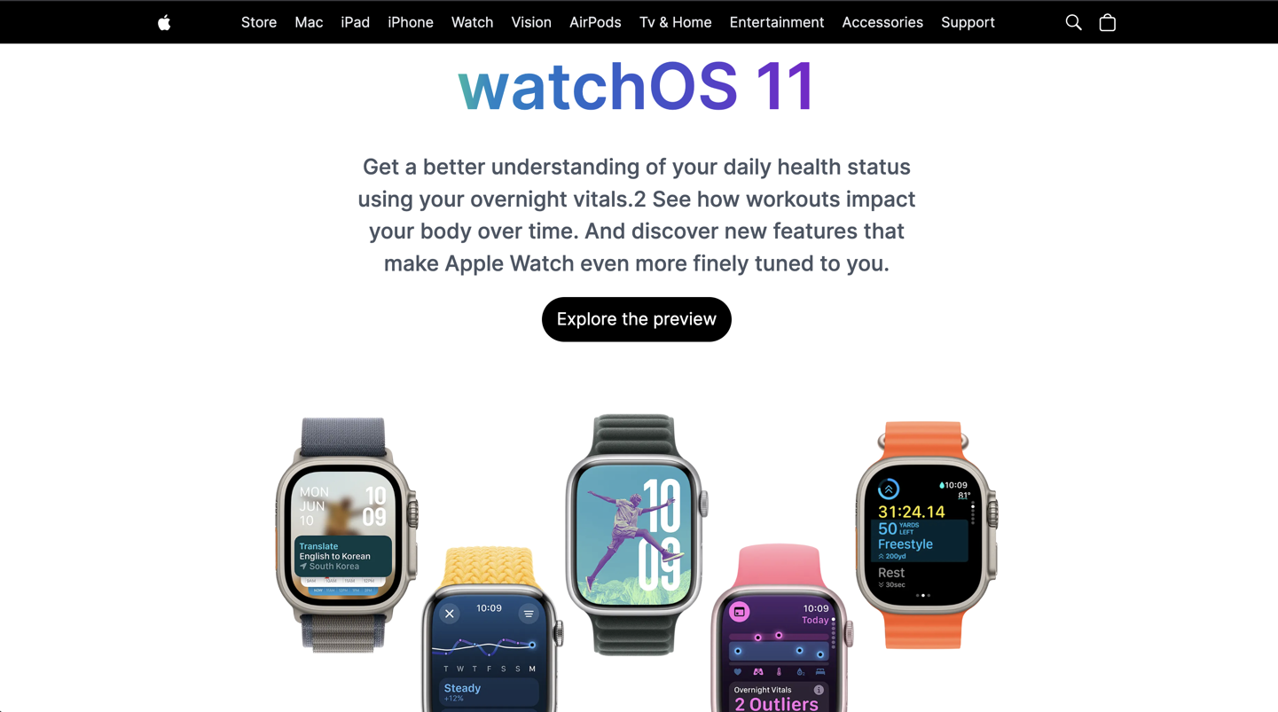
Brand-focused UI
Apple-inspired spacing, hierarchy, and motion built with Tailwind utility classes.
Reusable section patterns
Hero, product highlights, and footer blocks structured for easy extension across multiple pages.
Architecture
Architecture
Frontend
- Next.js
- React
- TypeScript
- Tailwind CSS
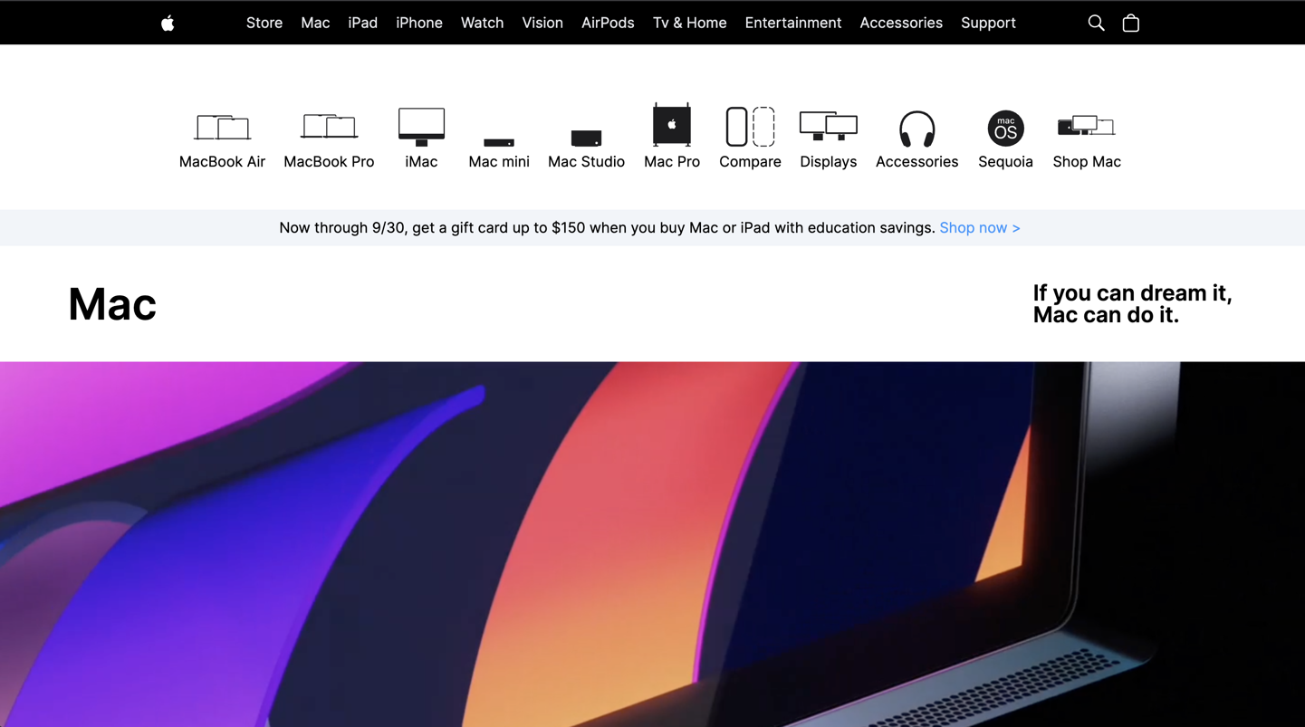
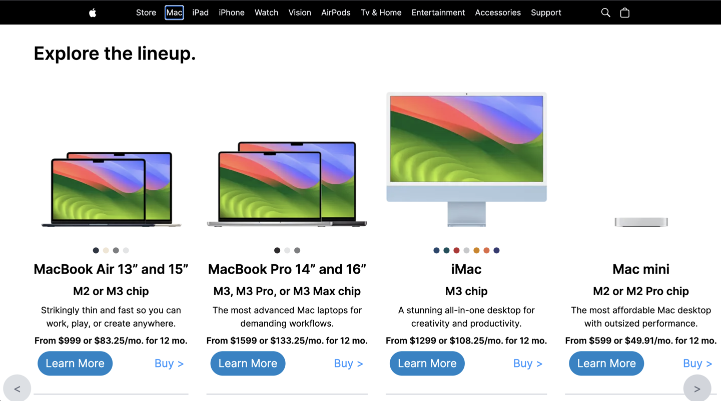
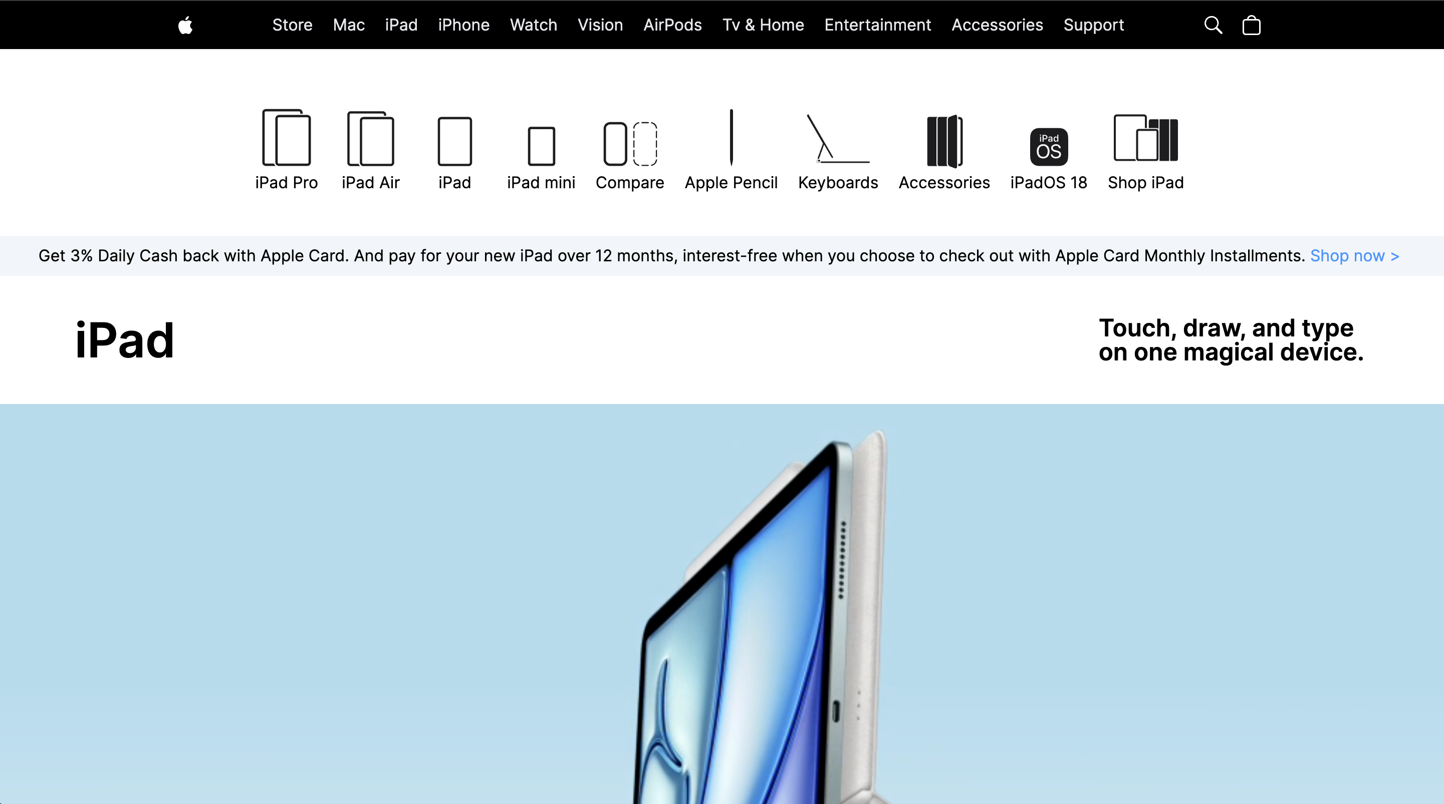
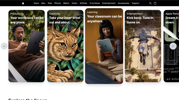
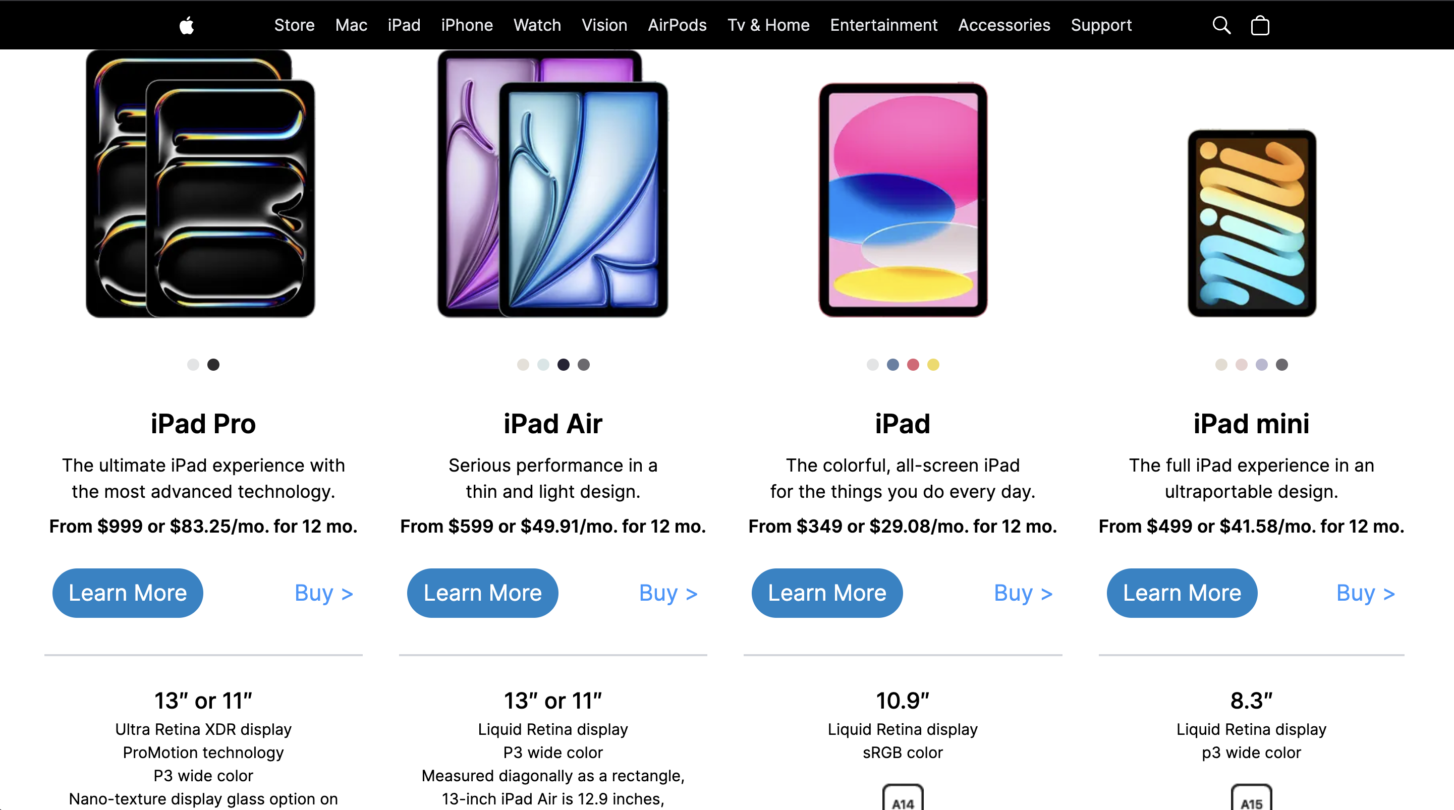
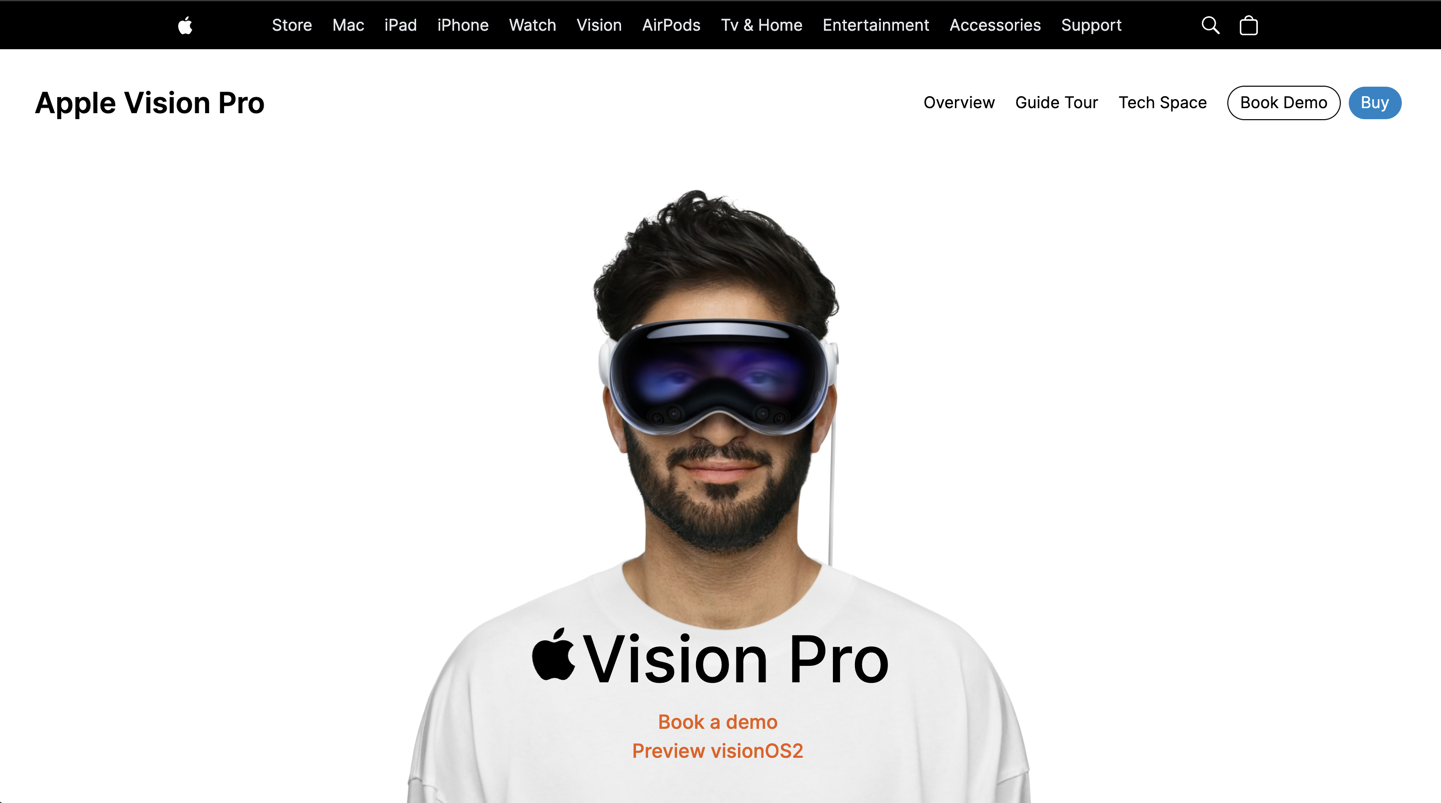
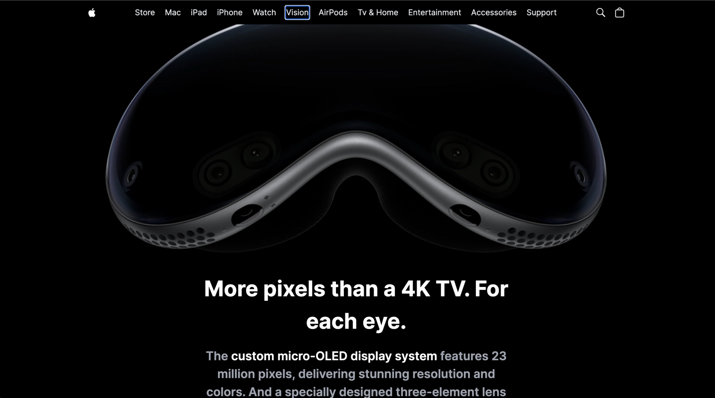
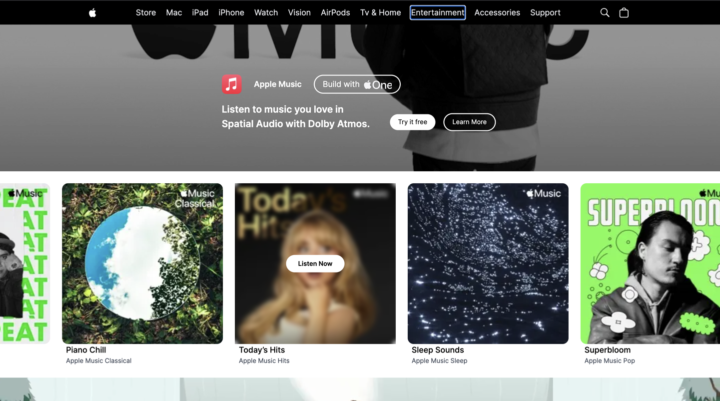
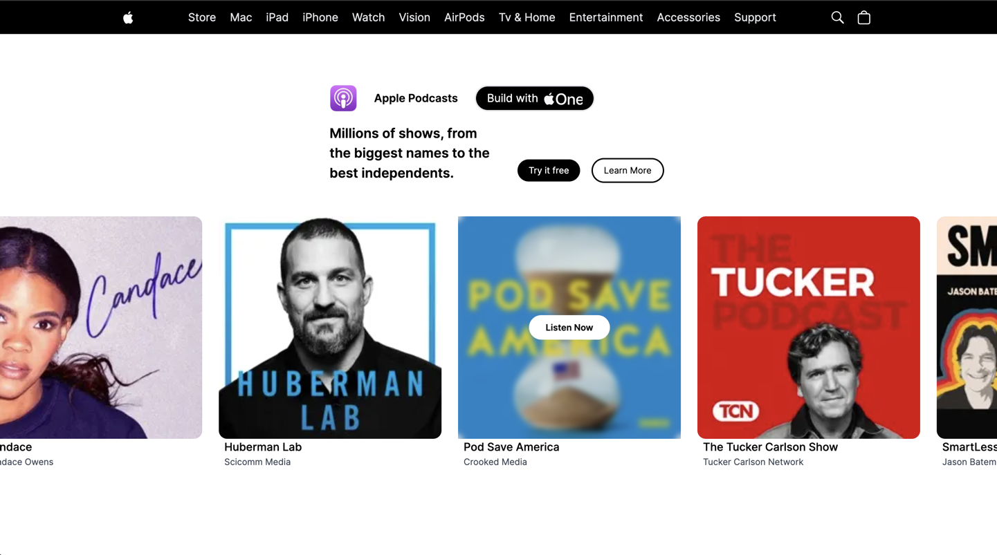
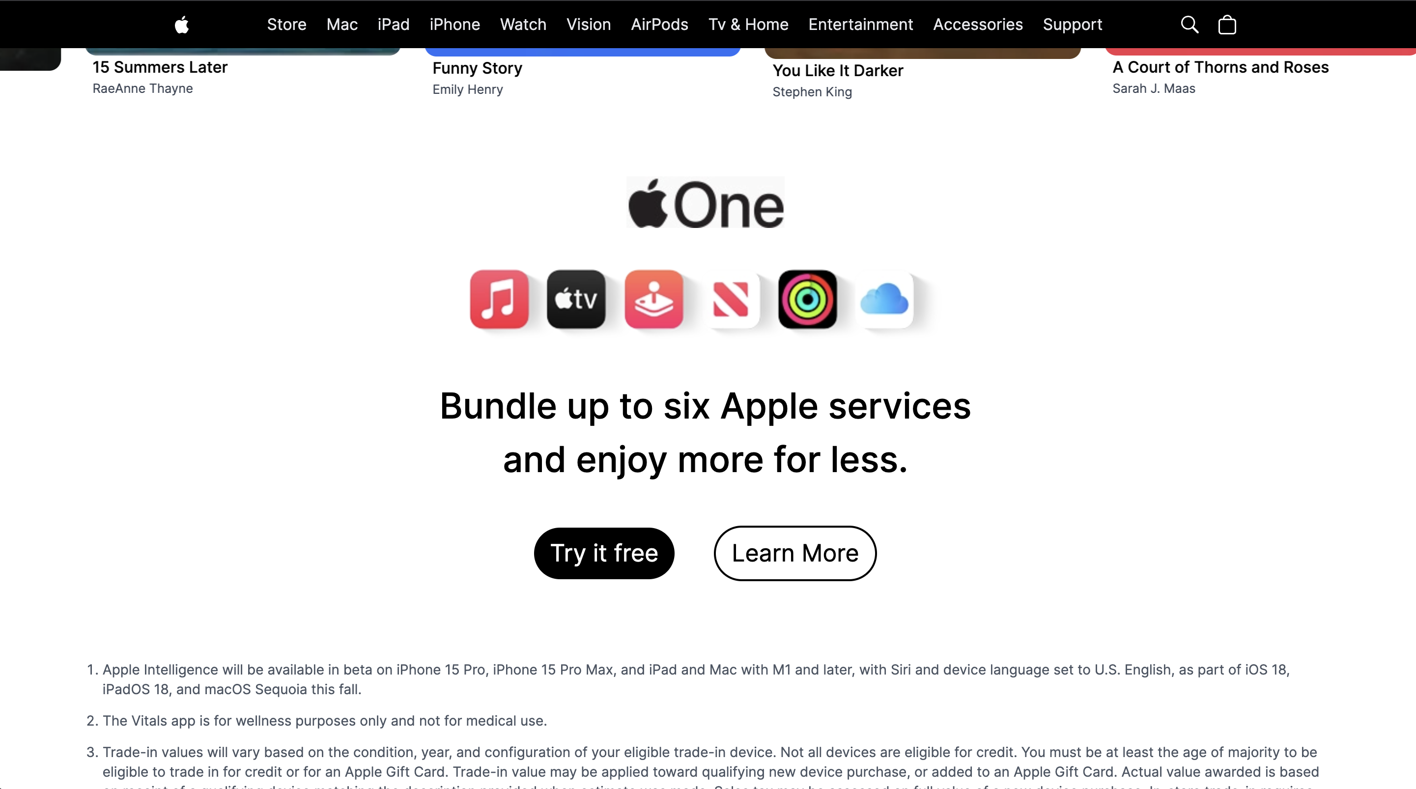
Gallery
Product Screenshots
Metrics
Metrics
Rendering
SSR with Next.js
UI system
Tailwind CSS
Pages
Multi-section marketing layout